WEB IMPROVEMENT
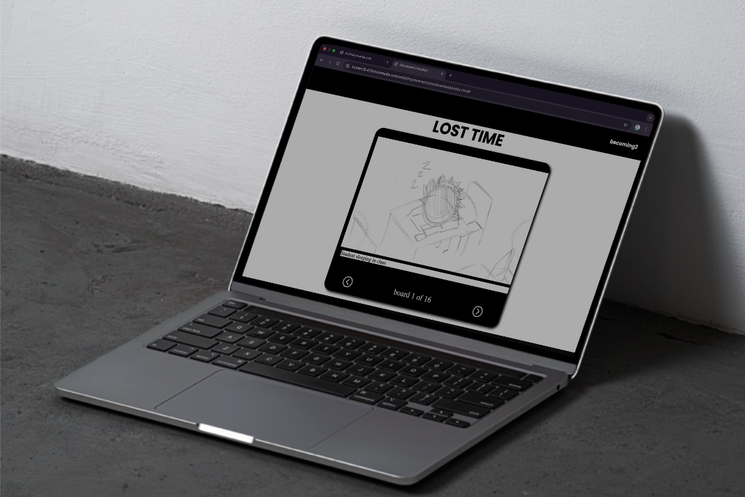
TITLE: LOST TIME
This project was to improve on the design and the technical aspect, such as fixing the coloring, the alignment, and overall, the coding. I did this back in my 2nd semester of winter
Feedback
"Fix the buttons to make sure it's working properly"
"Better to make the images expand when clicking on them"
"Remove any unnecessary information or design"
"I think it would be better to add sound or music"
"Keep the process in the same file"
The changes
I decided to keep it simple and keep it black and white. And also keeping th same story, because I found it funny.
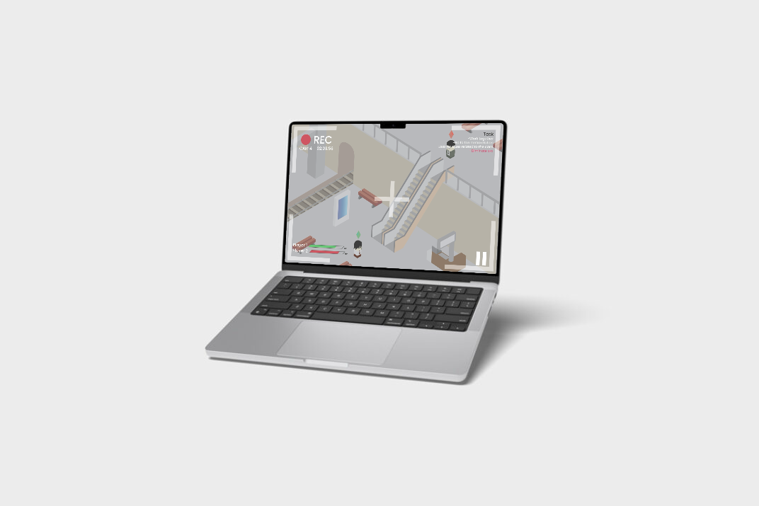
PRINT IMPROVEMENT
Title: Security Line
This project was to improve and expand my knowledge on my design skills. I picked the isometric project that I did during my 4th semester of winter 2024.
Feedback
"It would be better to use the whole canvas so it doesn't look empty."
"It's way to simple"
"The illustration looks flat. You can see it in the bricks. If you're going to make it look like bricks, then it's better to add shadow."
The changes
I decided to completly change the illustration from the previous one that I made. I wasn't to proud of it and I didn't put as much time and effort into it compared to the latest one that I'm currently presenting.